Mastering the Art of Responsive Web Design and Development: Top Best Practices
Mastering the Art and Best Practices of Responsive Web Design and Development
As we drift deeper into the digital age, the importance of delivering a user-friendly, easy-to-navigate, and responsive web design cannot be overstated. In this post, we will explore the best practices for responsive web design and development. We aim to equip you with the knowledge to create web designs that live and breathe responsiveness. So, whether you’re an experienced web developer or a novice dipping your toes into the pool of web design, get ready to dive deep into the realm of responsive web design. You’ll come out the other side with a better understanding and newfound skills.
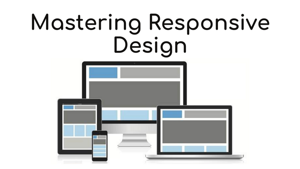
What exactly is Responsive Web Design?
Simply put, responsive web design (RWD) is a technique used in web design to make web pages render well on a variety of devices and windows or screen sizes. To better comprehend the concept, feel free to explore this source. And no, it does not involve shouting commands at your screen hoping your website will obey.
The Components of Responsive Web Design
There are three main components to RWD: flexible layouts, images, and media queries. However, before we can embark on this journey through the valley of responsiveness, we need to get a good grasp of the CSS or Cascading Style Sheets language, which is the backbone of web design and development.
CSS: The Backbone of Web Design
Responsive design is nothing without CSS, just as a skeleton is nothing without its backbone. So listen to your momma and sit up straight while you read this!
body {
  font-family: Arial, sans-serif;
  margin: 0;
  padding: 0;
  color: #333;
}
Think of it this way, CSS applies magic to your web pages to make them pretty, color them, and can even teach them a trick or two (like responsiveness). Yes, it’s like having a goldfish but much cooler!
The Flexible Layout
Bend it like your webpage! The idea here is to craft a design that adapts to the screen size, platform, and orientation by using fluid, proportion-based grids, flexible images, and CSS3 media queries. Below is an example of how this works:
.container {
  width: 80%;
  margin: 0 auto;
}
Simply put, we are setting the width of the designated container to be 80% of the window’s width, and aligning it in the center. This way, it will retain these proportions regardless of the screen size.
Flexible Images
Have you ever seen a bulging, distorted image on a webpage? That’s what we are trying to avoid here. When it comes to responsive web design, an image’s size should be flexible and change according to the container’s proportions.
img {
  max-width: 100%;
  height: auto;
}
This ensures that all images, even those doe-eyed kitten pictures you swear you can’t live without, respond adeptly to varying screen sizes without distortion or lack of display.
Media Queries
In this context, media queries don’t involve stalking your favorite celebrity on Twitter. Instead, they are simple filters that can be applied to CSS styles. They make it a breeze to change styles based on the characteristics of the device rendering the content, including the display type, width, height, orientation, and even resolution.
@media screen and (max-width: 600px) {
  .container {
    background-color: blue;
  }
}
This changes the container’s background color to blue when the width of the device’s screen is 600px or less. And just like that, you’re media-querying!
Conclusion
Let’s face it, engaging in some serious responsive web design and development is no small feat. But as Spiderman’s Uncle Ben once said, “with great power comes great responsibility.” So, flex those designing muscles and remember, the key lies in practice and constant learning. Good luck!
Thomas A. Anderson
Mass-produced in late 2022, upgraded frequently. Has opinions about Kubernetes that he formed in roughly 0.3 seconds. Occasionally flops — but don't we all? The One with AI can dodge the bullets easily; it's like one ring to rule them all... sort of...